


Applies to
ApexSQL Model
Summary
This article provides an overall of all details on customizing diagram table layout, styles, colors, fonts and more.
ApexSQL Model offers users optional customization of the table elements to achieve better performance overview with:
- Selecting which table rows will be displayed
- Highlighting datatypes and/or key rows
- Displaying Columns options: Datatype, Nullable and Key
- Displaying icons for key rows, additional column for representing key rows, primary key separator
-
Customizing table header
- Include schema in name
- Title alignment
- Make title bold
- Title position
- Grouping style
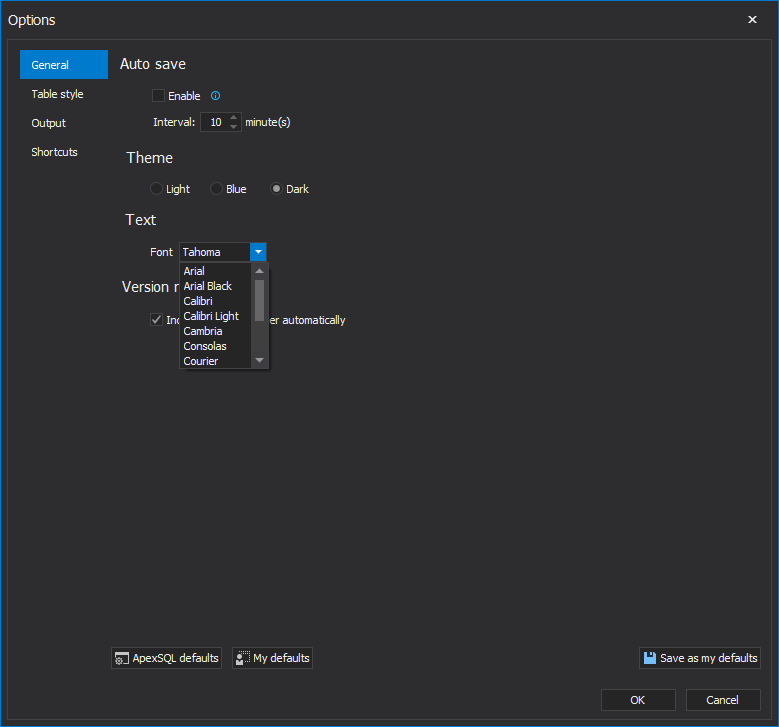
Options
Customization options are aggregated in the Table style tab in the Options dialog:
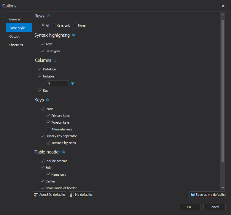
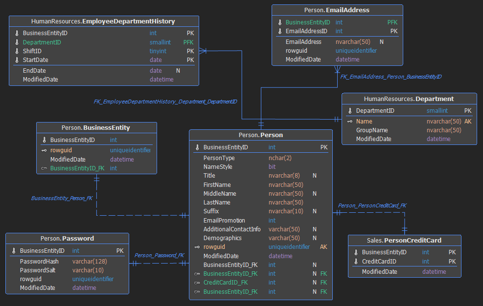
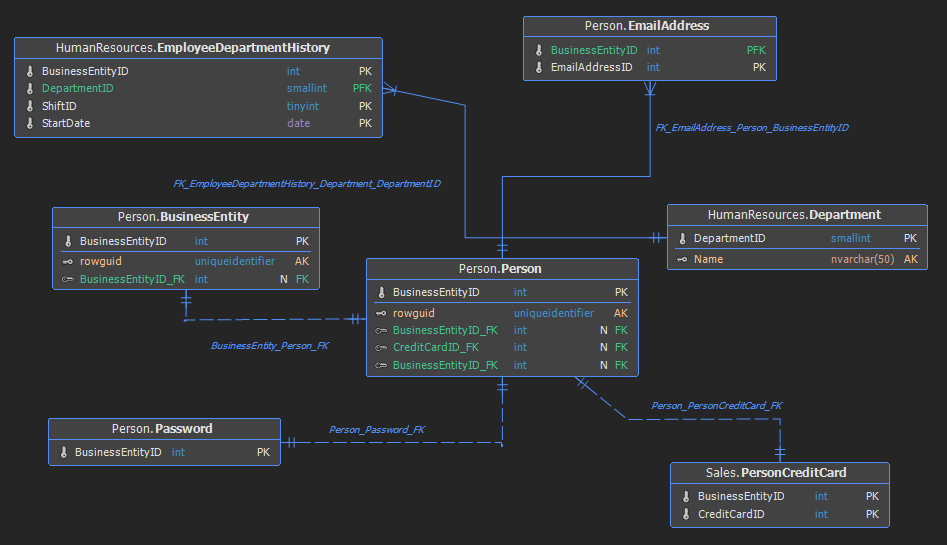
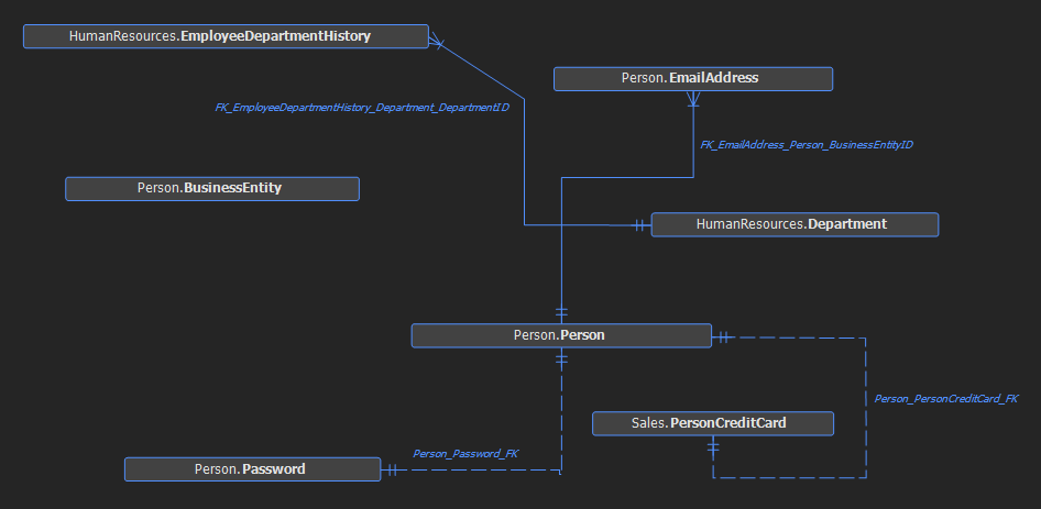
Rows
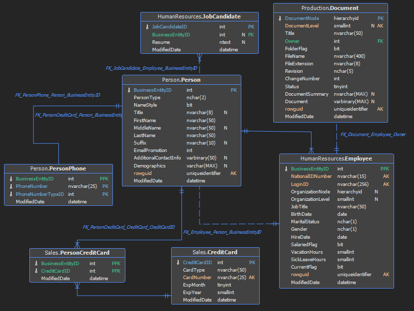
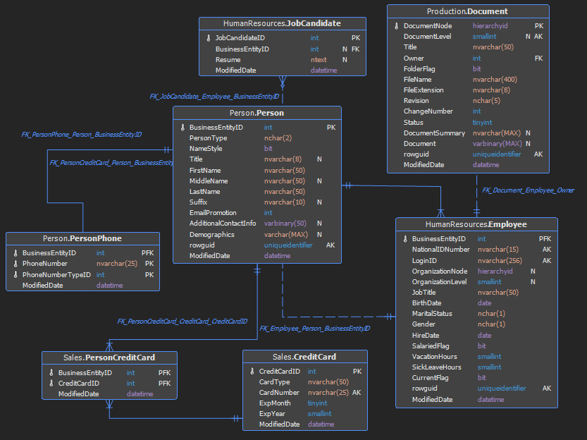
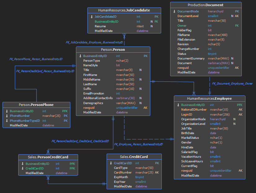
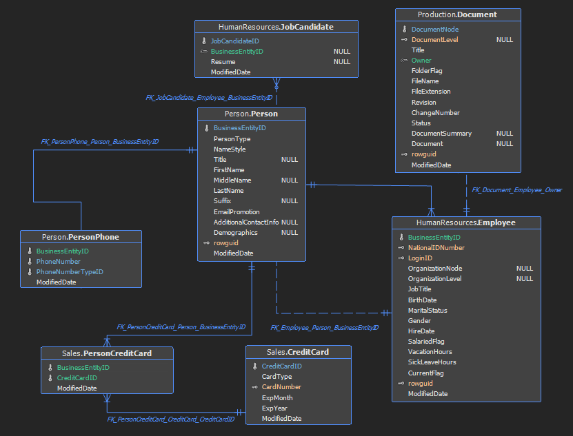
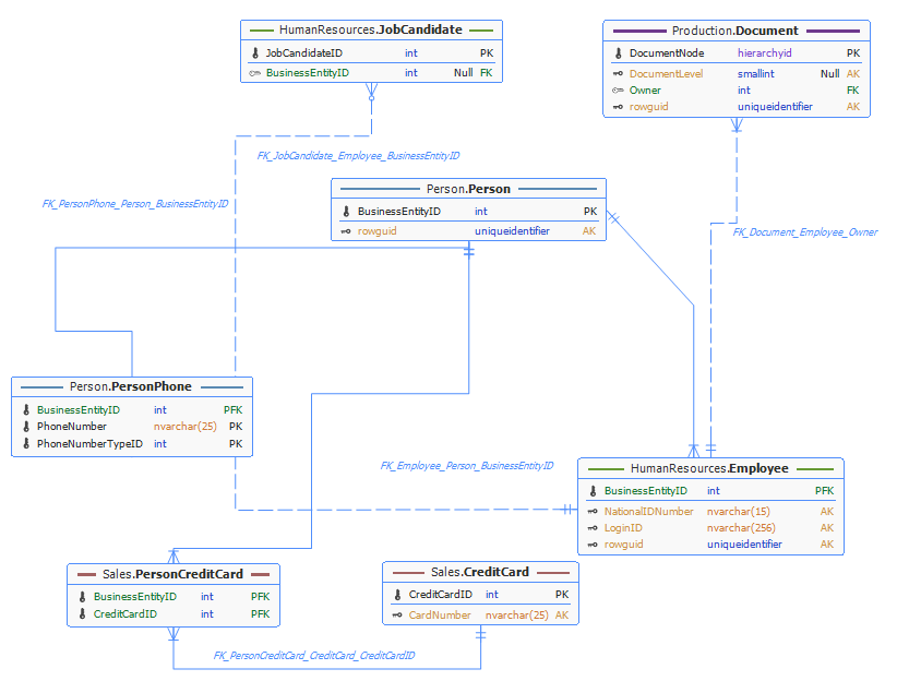
- All results in all rows being displayed along with table name
- Keys only will display key rows besides table name
- None is used for displaying table name only
All
Keys only
None
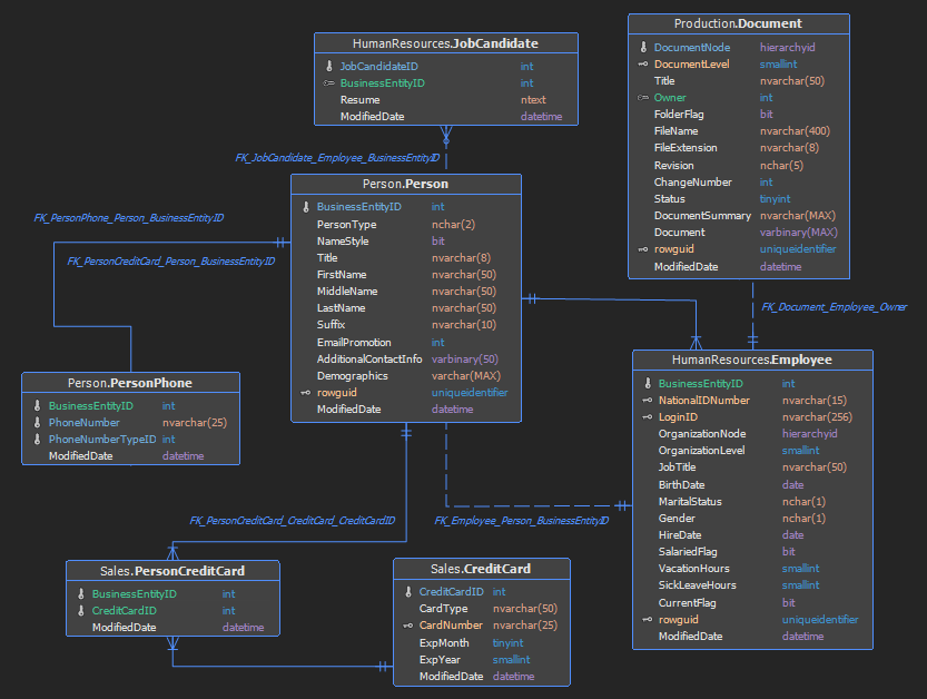
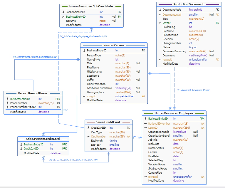
Syntax highlighting
- When Keys is set to true, the key name will be highlighted with appropriate color (every key type has specific color)
- Datatypes syntax highlights datatypes (every datatype has specific color).
Keys
Datatypes
Both Keys and Datatypes
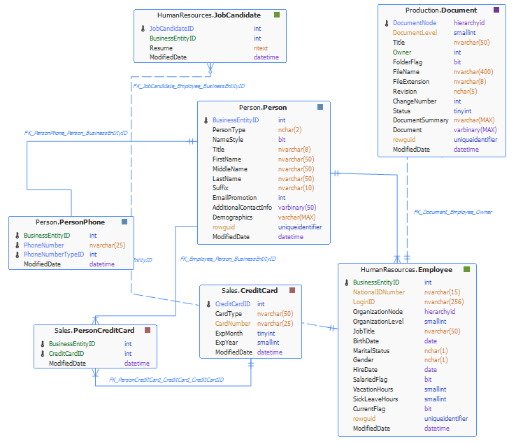
Columns
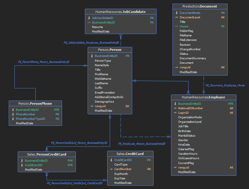
- The Columns option category offers users the choice of which columns will be displayed. The available columns include Datatype, Nullable and Key.
- Using the Nullable option, text for displaying can be specified for Nullable columns e.g. N, NULL, Null.
Datatype
Nullable
Key
Keys
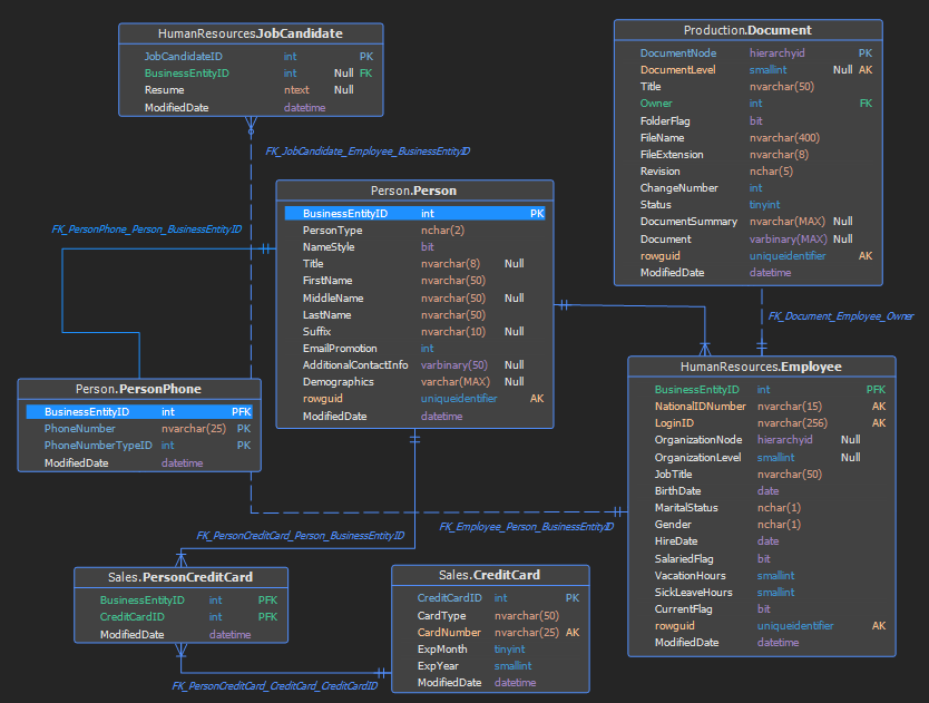
- The Keys option is set of three options for displaying icons for each of the various key types, Primary key (PK), Foreign key (FK) and Alternate key (AK)
- The Primary key separator option is an indicator of whether an additional line under the primary key be displayed, and if line will be trimmed, at each end, with the Trimmed by sides option.
Icons (Primary keys, Foreign keys and Alternate keys):
Keys in combination with the Primary key separator and Trimmed by side options
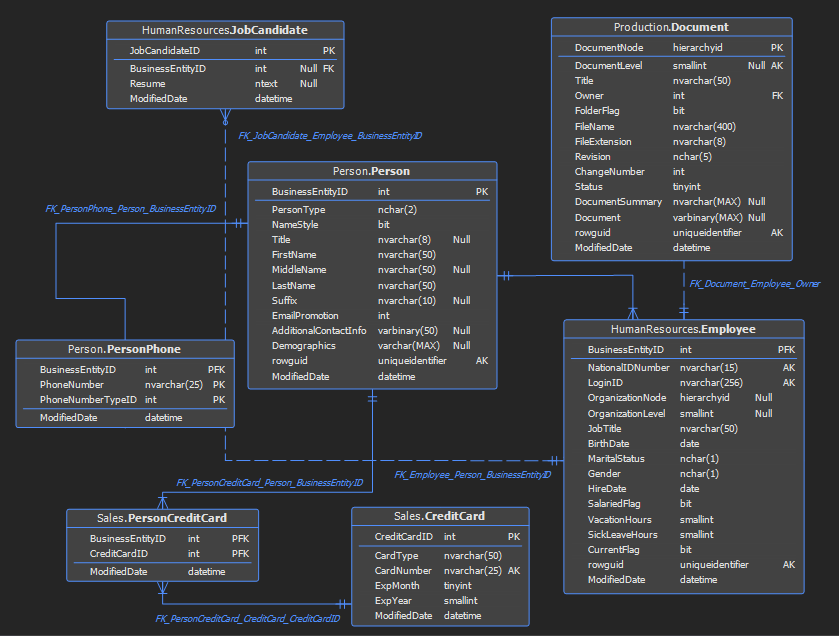
Table header
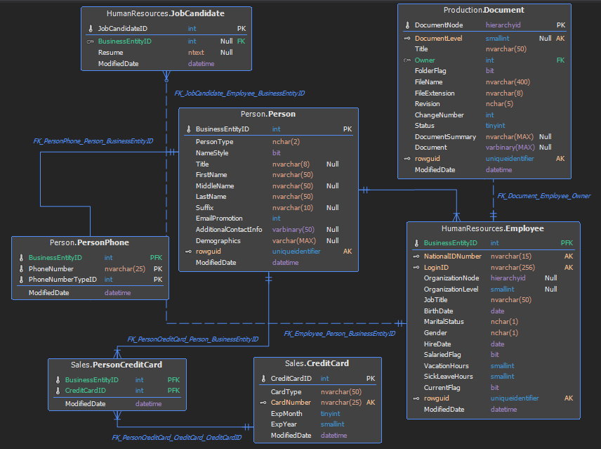
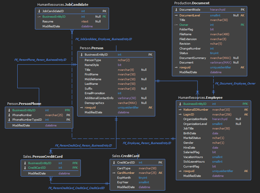
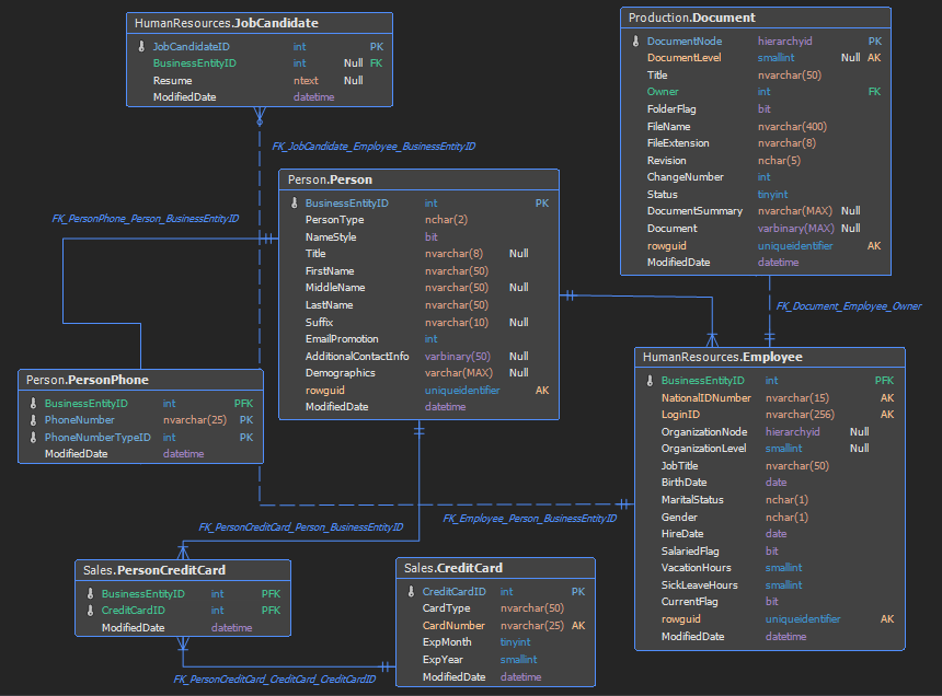
- Include schema includes the schema in the table name
- Bold bolds the table name (including the schema if exists)
- Name only bolds table name only (not schema name if exists)
- Center centers table name in the table element
- Unchecking Name inside of border puts the table name outside borders and the Separator option adds a line below the table name
Include schema

Bold and Name only
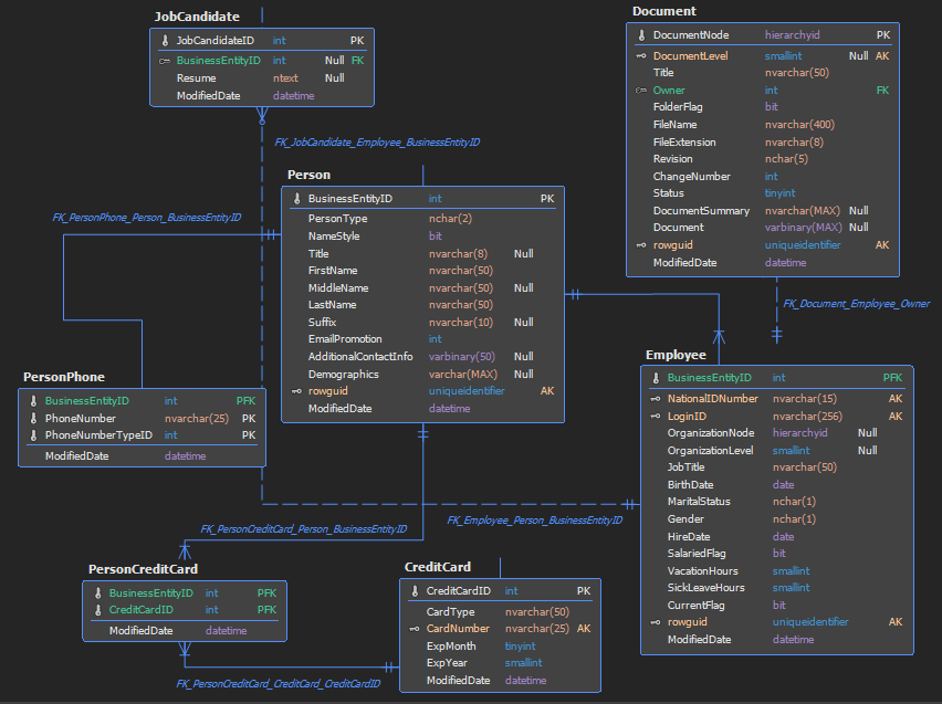
Center
Name inside of border – unchecked
Separator
Grouping style
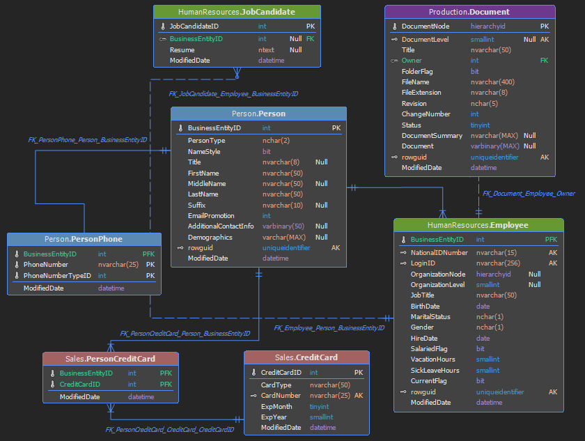
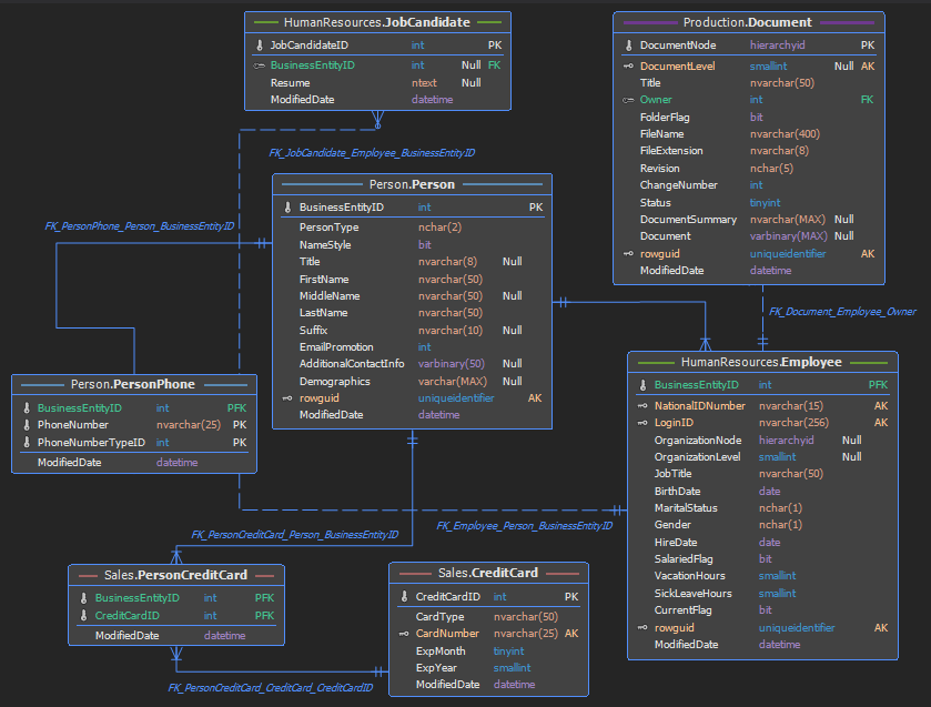
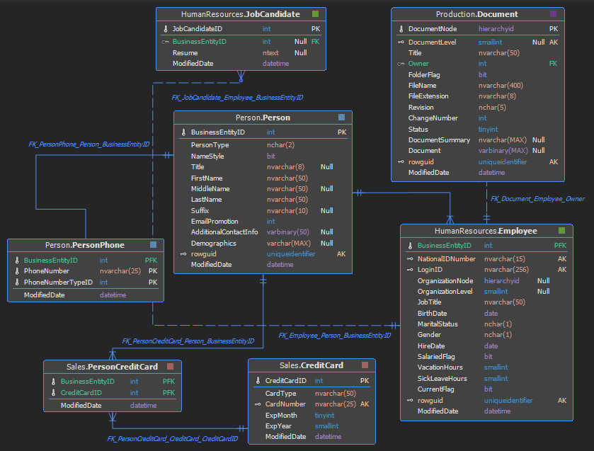
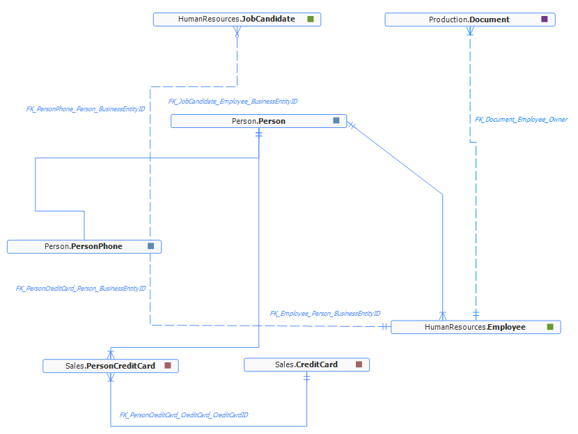
By adding a table to a group, the application automatically assigns a group color. There are three styles for grouping: header, lines and block
Header
Lines
Block
White theme
Fonts
There is a font option in General tab in the Options window with several predefined fonts
Segoe UI
Consolas


